Sellotape
Making the everyday essential feel unmistakably iconic again by dialling up craft, style and play.
Industry
Consumer Brands
Discipline
Strategy, Brand Identity, Packaging
Conceptual project completed during Shillington Graphic Design Course
Challenge
How does Sellotape reclaim its position as the UK's original household tape in a market crowded with cheaper alternatives?
Response
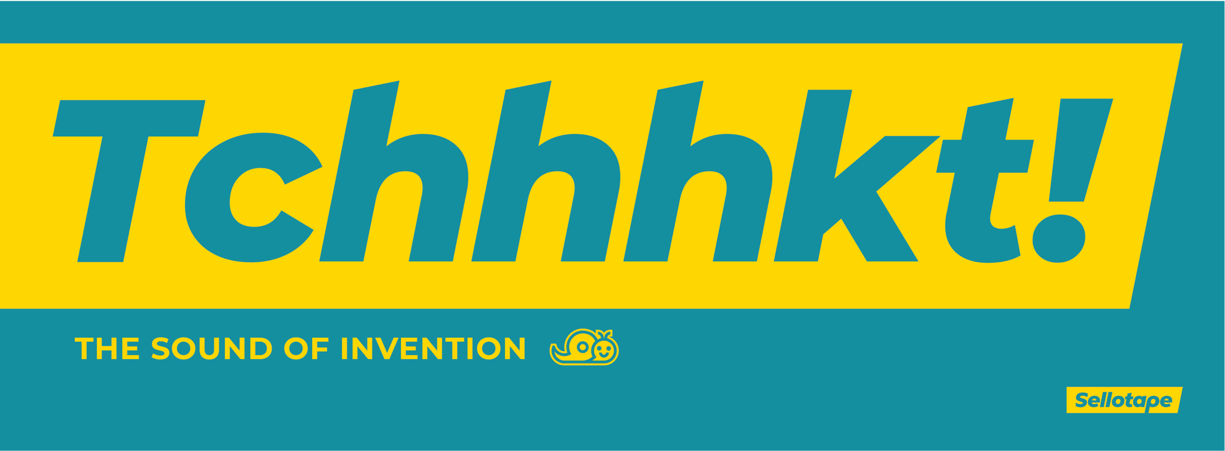
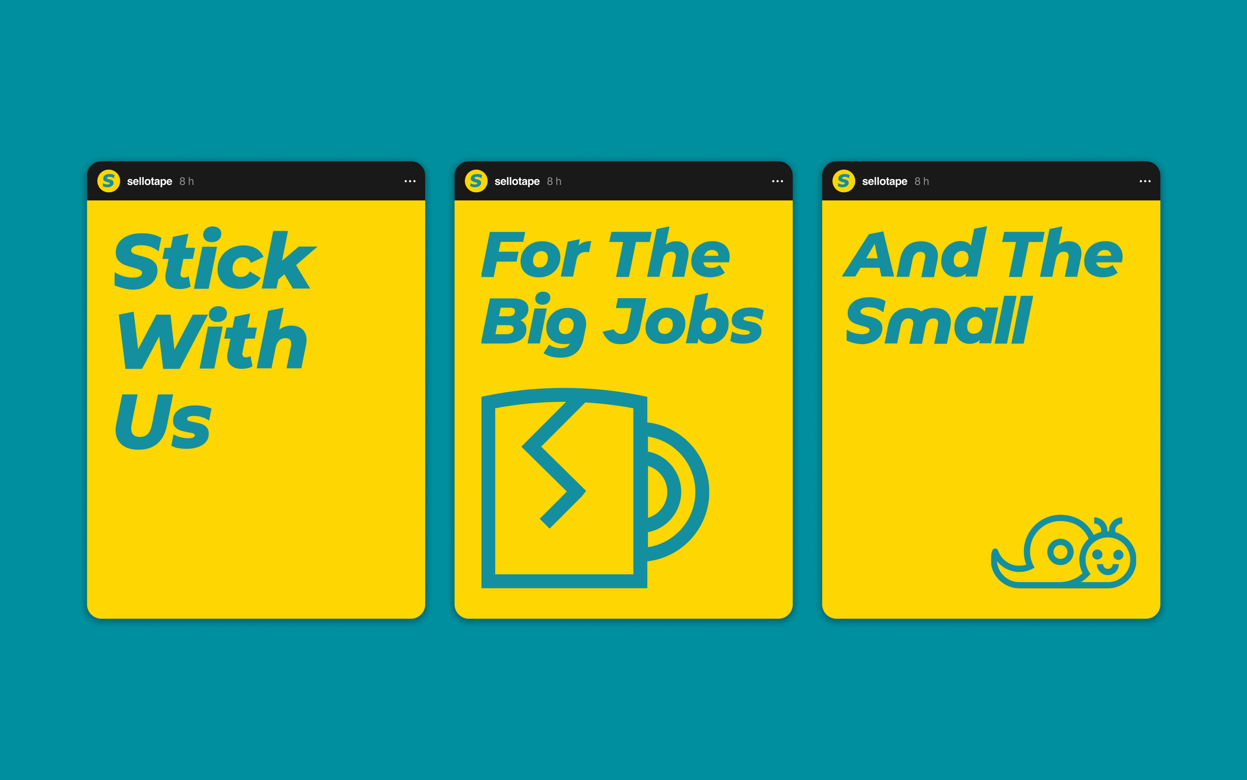
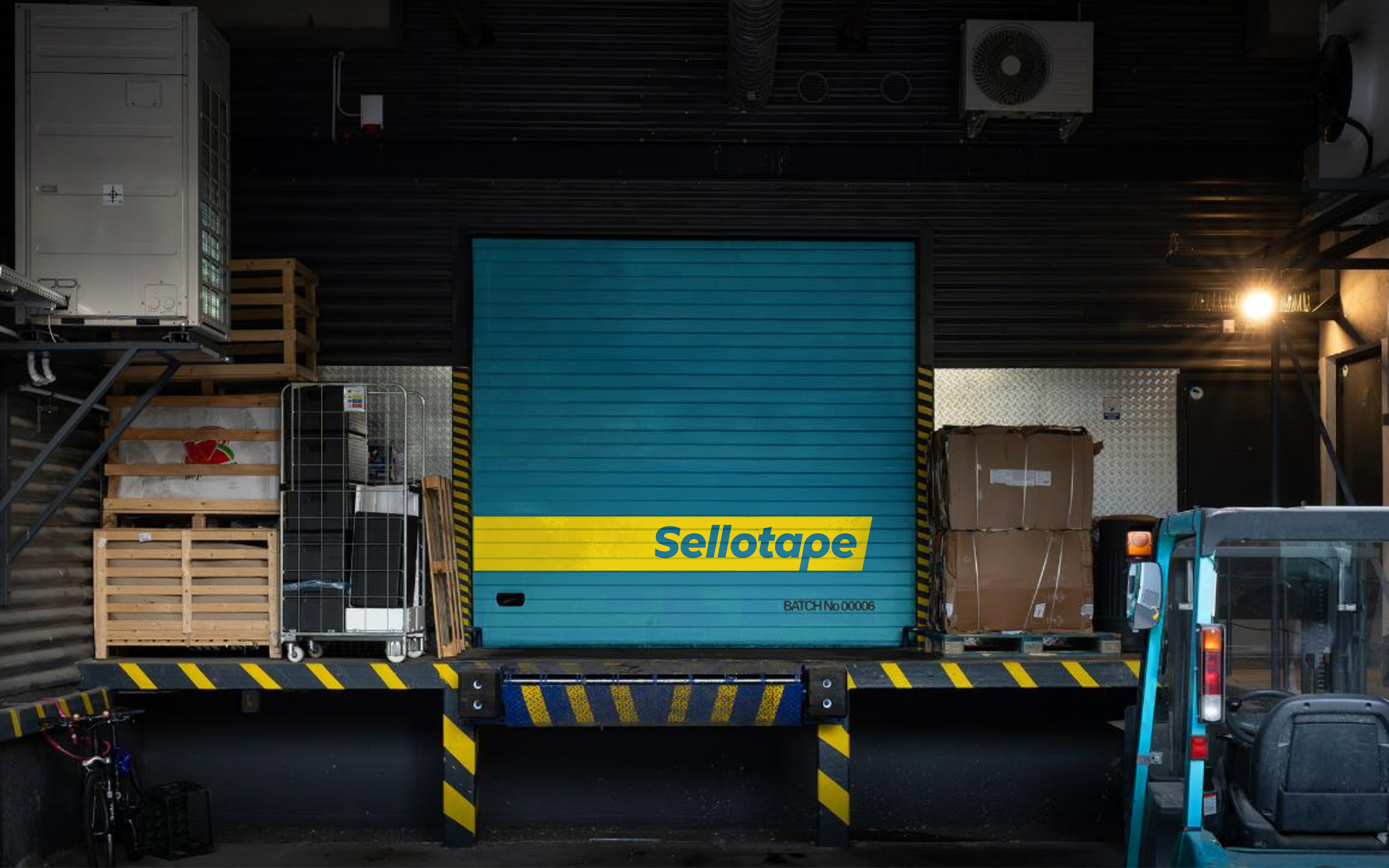
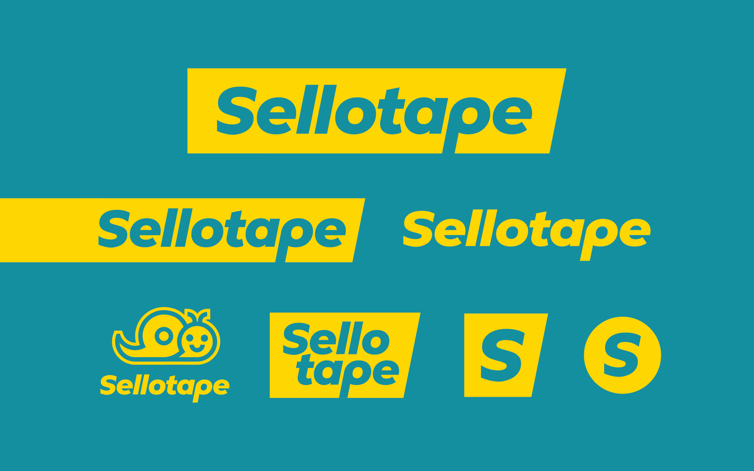
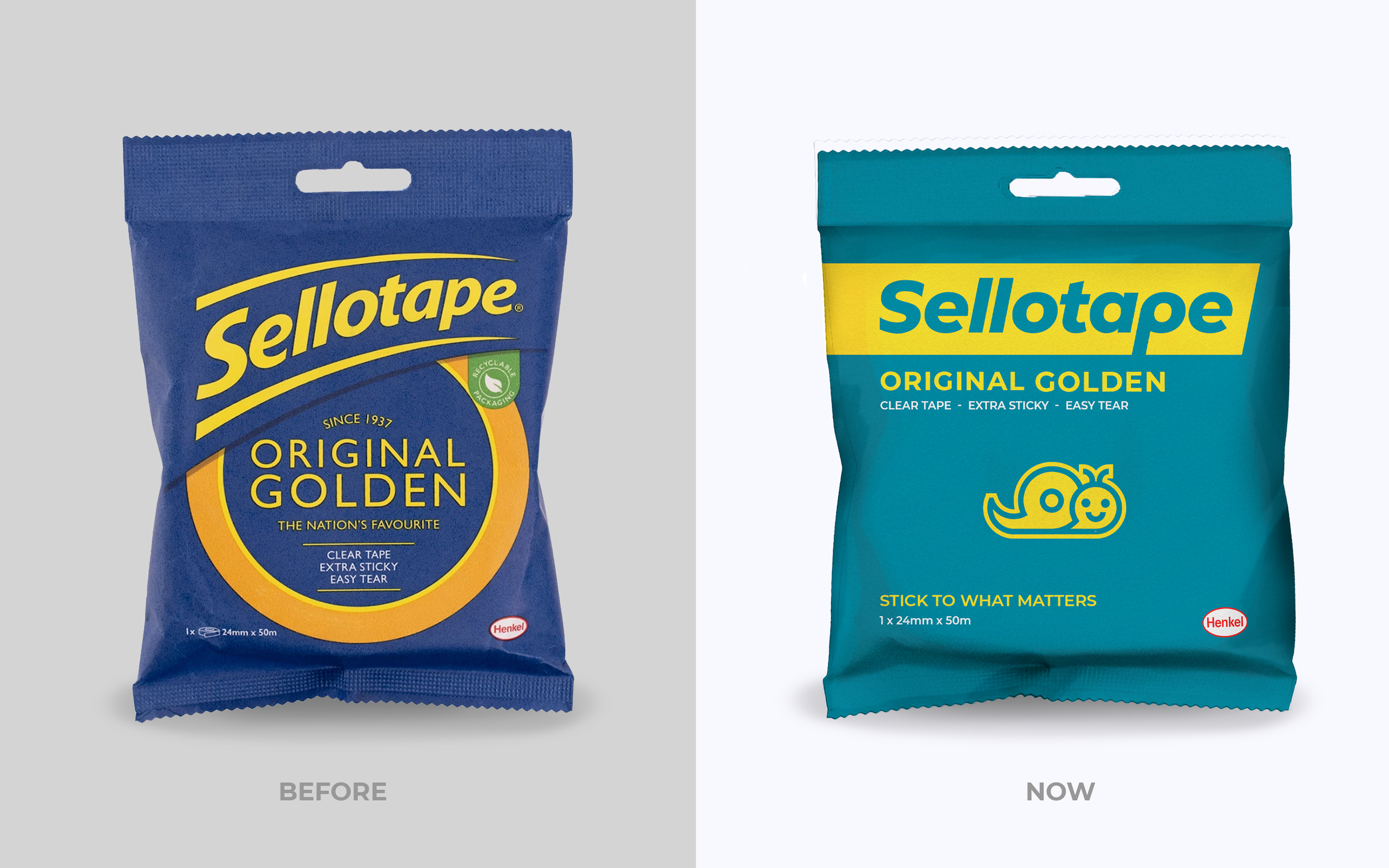
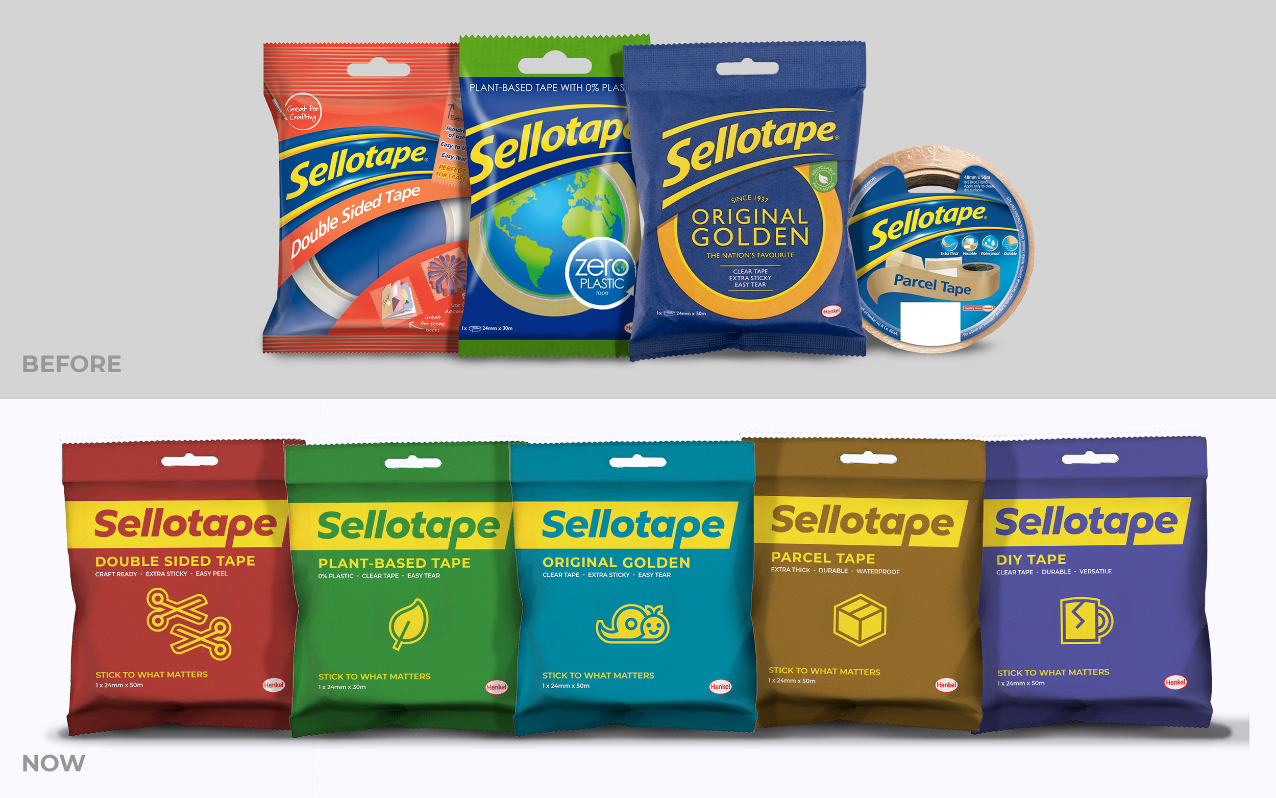
The rebrand celebrates the qualities that have made Sellotape iconic for generations. A custom typeface draws inspiration from the product's history and physical form, while a playful symbol set captures both creativity and everyday utility. The tape's unmistakable sound becomes the brand's defining asset through a bold out-of-home campaign. Exaggerated scale creates moments of surprise, reinforcing the brand's playful character across every touchpoint.
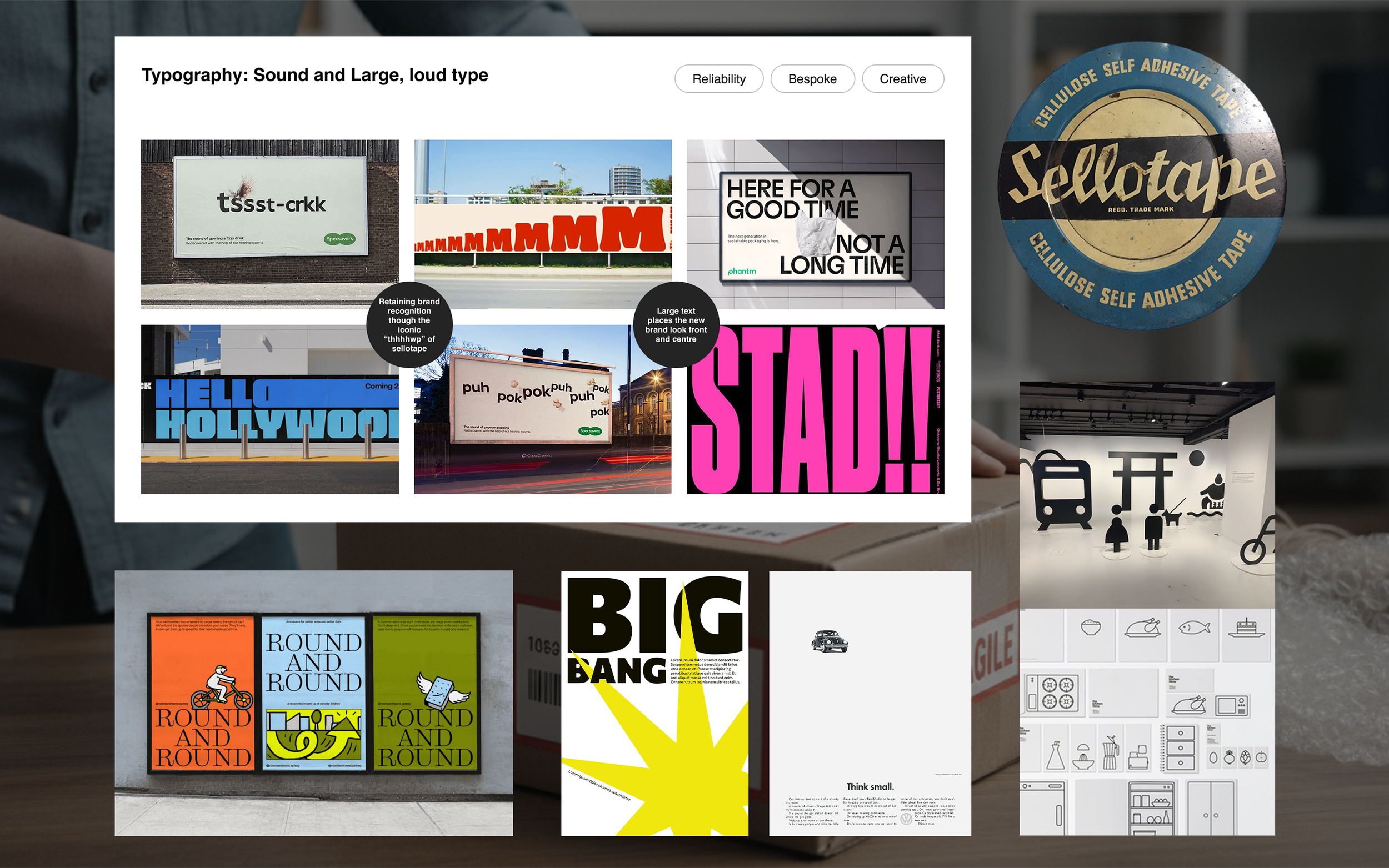
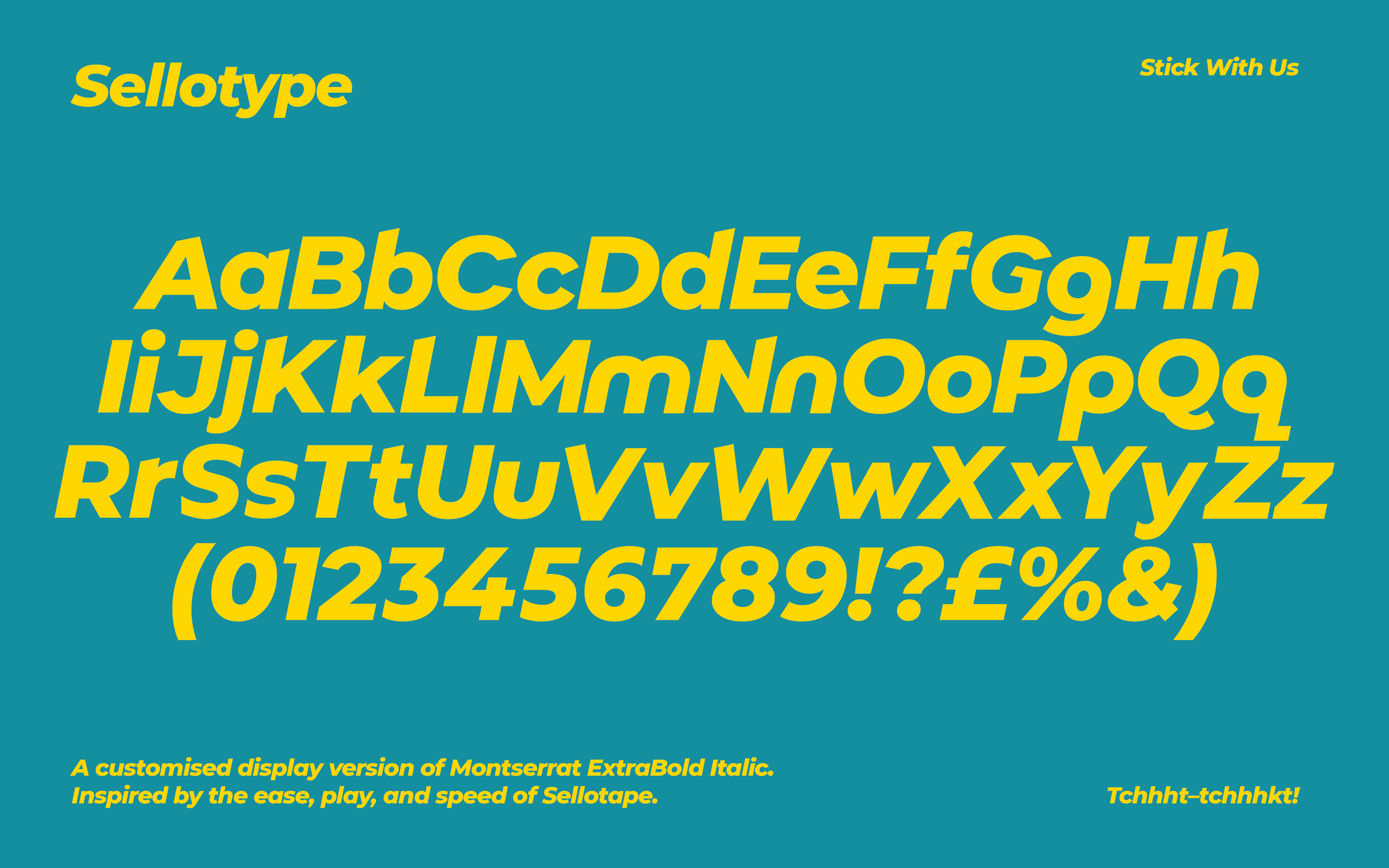
A legacy sound championed! Sellotape brings it’s iconic sound centre stage.